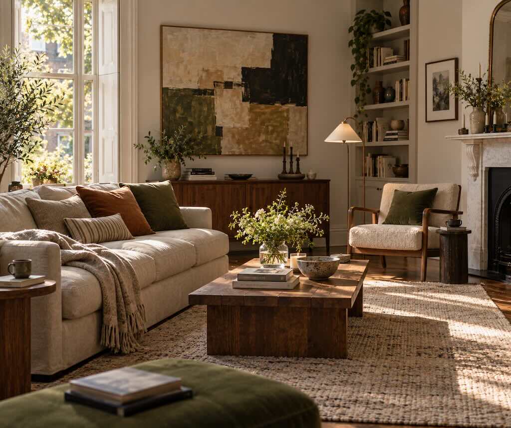
It is easy to know what style you like.
You can save photographs of dark wood kitchens, striped sofas, old apartments, pale plaster walls or rooms filled with color. You can decide that you like modernism, traditional interiors, warm minimalism or absolutely none of the above.
Knowing what you like does not necessarily tell you why one room works and another doesn’t.
A room can contain beautiful furniture and still feel strangely unresolved. Another can be furnished with fairly ordinary things and feel immediately convincing. Sometimes the difference has surprisingly little to do with style.
Underneath decorating trends are older design principles concerned with relationships: balance, scale, proportion, emphasis, rhythm and unity. These ideas apply well beyond interiors, but rooms make them unusually easy to experience because we don’t simply look at a room. We move through it, sit in it and live among its objects.
You do not need to turn your home into a design exercise or memorize a vocabulary before buying a lamp. But understanding a few of these principles can explain why moving one chair twenty inches sometimes improves a room more than buying five new things.
Start with what the room is supposed to let you do
Before composition comes use.
A living room can look excellent in a photograph while being irritating to inhabit. The coffee table is too far from the sofa. Nobody can put down a drink. The reading chair receives almost no useful light. Walking from the doorway requires navigating the corner of an ottoman. Six people can technically sit down, but none of them can comfortably talk to one another.
These are not styling failures.
They are clues that the visual arrangement has been allowed to outrank the life happening inside it.
A useful first question is therefore not “What does this room need?” but “What happens here?”
Watch the room for a few days. Notice which chair everybody chooses and which one nobody does. Look at where books accumulate, where somebody naturally puts down a coffee cup and which path through the room you take without thinking.
A room is already telling you how it wants to work.
Scale is often the invisible problem
Some decorating problems are difficult to diagnose because nothing is individually wrong.
The sofa is attractive. The rug is attractive. The artwork is attractive. The lamp is attractive.
Together, something feels off.
Scale may be the reason.
In design, scale concerns size in relation to something else, while proportion concerns the size relationships between parts. Iowa State University Extension’s guide to design principles makes the distinction with a wonderfully simple example: an adult and child’s rocking chair can each be proportioned correctly within themselves while being completely different in scale for the person using them.
The same problem occurs constantly in rooms.
A tiny pendant light can appear lost above a large dining table. A delicate side table may look nervous beside a deep, substantial sofa. A small rug can make perfectly good furniture appear as though it has drifted apart. An enormous sectional can visually consume a modest room before anything else has had a chance.
This is why measurements alone do not solve every decorating problem. A piece of furniture can physically fit while still feeling wrong in relation to everything around it.
Proportion is about relationships, not a magic ratio
Interior advice is full of numbers.
Hang this at this height. Make the coffee table this fraction of the sofa. Use this percentage of one color and that percentage of another.
Rules can be useful because they give you somewhere to begin. They become less useful when the number itself starts mattering more than the relationship it was intended to improve.
Proportion is more fundamental.
Look at the width of the artwork in relation to the furniture beneath it. Look at the height of the lamp beside the chair it serves. Look at the amount of empty wall surrounding a cabinet. Look at the relationship between the large pieces and all the smaller objects scattered around them.
The question is not whether everything follows the same formula. It is whether the parts seem to belong to the same composition.
A room with good proportion can contain enormous differences in size. In fact, those differences often make it more interesting. A large painting above a restrained console can be far more convincing than three small pictures chosen merely because they fit the available wall.
The important thing is that the difference looks intentional rather than accidental.
Balance does not mean making both sides match
Balance is one of the easiest design principles to feel and one of the easiest to misunderstand.
It does not require putting an identical lamp on either side of everything.
Symmetry is one way of creating balance, and sometimes it is exactly right. Two bedside tables beside a bed can give a bedroom immediate structure. A pair of chairs facing a fireplace can create calm and formality.
But balance can also be asymmetrical.
A substantial armchair on one side of a living room might be visually balanced by a smaller chair, floor lamp and side table on the other. A large dark cabinet can be countered by several lighter objects occupying more space elsewhere.
This is the idea of visual weight. Oklahoma State University Extension describes it as the amount of attention a design element attracts, noting that size, contrast, color and other qualities can make something appear visually heavier or lighter. Balance distributes that visual weight rather than simply counting objects on either side.
It explains why one small bright red chair can affect a room more strongly than a much larger beige sofa.
Your eye is not measuring furniture.
It is responding to presence.
Empty space has visual weight too
When a room feels unfinished, the instinct is often to add something.
Another chair. Something on the wall. A basket beside the cabinet. Two more objects on the shelf.
Sometimes the room needs exactly the opposite.
Empty space allows individual objects to establish themselves. A chair with a little room around it looks different from the same chair wedged between a side table, plant and storage basket. Artwork can become more important when it does not have to compete with five other things.
This does not mean sparse rooms are inherently better designed. A richly layered room can have excellent visual structure, while a nearly empty one can feel awkward and unresolved.
The point is that empty space is part of the arrangement.
Before filling an apparently blank corner, consider whether that blankness is helping something nearby look better.
A room usually needs somewhere for the eye to arrive
Imagine entering a room in which the patterned rug, enormous television, bright artwork, colorful cushions, sculptural lamp and dramatic wallpaper are all competing to be noticed first.
Nothing is necessarily ugly.
The problem is that everything is shouting at approximately the same volume.
Design calls the alternative emphasis or hierarchy: allowing some elements to command more attention than others.
A J. Paul Getty Museum guide to the principles of design describes emphasis as the part of a composition that attracts attention, often because it differs from its surroundings in size, color, texture or shape.
In a room, that might be architecture rather than decoration.
A fireplace may already be the natural anchor. So might a large window, an old cabinet, a particularly good painting or the dining table in an open-plan room.
Once you know what deserves attention, other decisions become easier. Some things can support the focal point instead of competing with it.
Not every object needs a solo.
Rhythm is why repetition makes a room feel connected
Rooms need repetition, although rarely the obvious kind.
You do not need six identical cushions or matching furniture sets. Repetition can be quieter than that.
A dark wood tone appears in the dining table and then again in a picture frame across the room. A rounded lamp echoes the curve of an armchair. Brass appears on a cabinet handle, disappears for several feet and returns in a small lamp.
Your eye begins making connections.
This is rhythm. Iowa State University’s design guide describes it as a sense of movement created by repeating shapes, forms, colors, textures or lines.
The important word is movement.
Repetition helps carry attention through the room rather than trapping it in one place. A color used once may look accidental. Used thoughtfully in three separated areas, it can become part of the room’s visual language.
Too much repetition has the opposite problem. When every wood matches, every metal matches and every chair comes from the same range, the room can lose the variation that makes it feel collected rather than assembled.
Rhythm needs repetition, but it also benefits from interruption.
Contrast keeps harmony from becoming sameness
A harmonious room does not require everything to agree.
Often the rooms that hold attention contain a small amount of friction.
An old wooden table beneath a contemporary pendant. A severe black chair beside a soft linen sofa. Glossy ceramic against rough stone. Something highly geometric in a room otherwise filled with curves.
Contrast makes differences visible. It can come from color, shape, material, age, texture, scale or finish.
The useful distinction is between contrast and competition.
One unexpected chair can give a quiet room character. Seven unrelated statement pieces may prevent any of them from having much impact.
This is why rooms built entirely around matching can feel strangely flat. Unity tells us the pieces belong together. Contrast gives us a reason to keep looking.
Good lighting changes the composition after dark
A room is not one visual composition throughout the day.
Morning sun can make a wall the dominant feature. By evening that wall disappears and a lamp-lit corner becomes the visual center instead.
This is why lighting should not be treated merely as the final decorative layer.
A floor lamp beside a chair creates both a useful pool of light and a visual destination. A pendant defines the dining table. A small lamp on a shelf can give depth to a corner that otherwise disappears after sunset.
Instead of asking whether the room has enough lamps, look at what the light is doing to its structure.
Where does your eye go at night? Which areas become flat? Is everything illuminated equally, or are there quieter and brighter areas?
The evening version of a room deserves to be designed too.
The best arrangement may not be the most photogenic one
Interior photographs have taught us to look at rooms from fixed viewpoints.
Real rooms are rarely experienced that way.
You enter from a doorway. Walk behind the sofa. Reach for a book. Sit down. Turn toward another person. Cross the room carrying a plate. Open a cabinet.
A composition that looks perfect from one camera angle may interrupt every one of those movements.
This is where function returns to the conversation. The visual principles matter because they help organize the room, but they are not supposed to overpower its use.
A chair can be slightly less perfectly positioned if moving it means somebody actually sits in it.
The coffee table can be off-center if that makes the route through the room easier.
A pile of books beside the sofa may disrupt the pristine composition while making the room considerably better for the person who lives there.
You can diagnose a room before buying anything
If a room does not feel right, resist beginning with shopping.
Stand at the doorway instead.
Where does your eye go first? If the answer is nowhere, the room may need stronger emphasis. If your attention goes everywhere at once, it may need less competition.
Look at the largest pieces. Do they seem appropriately scaled to one another and to the room?
Look at visual weight. Does one side feel substantially heavier? Could moving a lamp, chair, plant or artwork restore balance without making the arrangement symmetrical?
Look for repetition. Is there a color, material or shape that appears once and then disappears? Could something already in another room create the connection?
Finally, walk through it.
If you have to alter your natural route because of the furniture, the room may have a circulation problem rather than a decorating problem.
Move things before replacing them.
Rooms are surprisingly sensitive to inches.
Style comes afterward
None of these principles will tell you whether your sofa should be green velvet or brown leather.
That is the good part.
Balance does not belong to minimalism. Rhythm does not belong to traditional interiors. Scale is not Scandinavian, modern, maximalist or rustic. A room filled with antiques and a room built around chrome and glass can both use the same underlying ideas while looking nothing alike.
Style is where personality enters. Design principles simply give that personality some structure.
And once you begin seeing rooms in terms of relationships rather than individual objects, decorating becomes less about finding the next perfect thing.
Sometimes the room already contains what it needs.
It just needs the pieces to have a better conversation with one another.
Frequently asked questions
What are the main principles of interior design?
Common design principles include balance, proportion, scale, emphasis, rhythm and unity or harmony. Different design traditions and teaching materials organize the terminology slightly differently, but the underlying ideas concern how visual elements relate to one another rather than prescribing a particular decorating style.
What is visual balance in a room?
Visual balance is the distribution of apparent visual weight. Large size can make an object feel visually heavy, but so can strong color, high contrast or distinctive texture. A room can be balanced symmetrically with similar elements on either side or asymmetrically with different objects that nevertheless create a sense of equilibrium.
What is the difference between scale and proportion in interior design?
Scale concerns the size of something in relation to another object, a person or the surrounding space. Proportion describes relationships between the parts of an object or composition. Both matter when choosing furniture, rugs, lighting and artwork because an item can physically fit in a room while still appearing too large or too small in relation to its surroundings.
What is rhythm in interior design?
Rhythm is created when elements such as colors, materials, shapes, lines or textures repeat through a room and help move the eye around it. The repetition does not have to be exact. A particular wood tone, curved shape or accent color can recur in different forms without making the room look matched.
How can I make a room look better without buying new furniture?
Start by changing relationships between what you already own. Check circulation, move furniture slightly closer together or farther apart, reconsider the focal point, remove objects that are competing for attention and redistribute visual weight. Changing lamps, artwork and objects between rooms can also alter rhythm and balance without requiring new purchases.