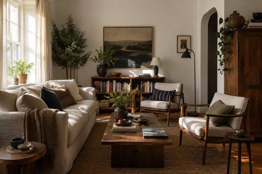
A room can contain beautiful furniture, expensive materials and carefully chosen colors and still feel slightly wrong.
Nothing is obviously misplaced. The sofa fits. The rug coordinates with the walls. The lighting is pleasant. There may even be plenty of empty space.
And yet one side of the room seems heavier than the other. A large cabinet dominates everything around it. A tiny coffee table appears stranded in front of an enormous sofa. One corner contains nearly every object worth looking at while another feels strangely unfinished.
The problem may have less to do with style than with something interior designers work with constantly: visual weight.
What is visual weight in interior design?
Visual weight is not the same as physical weight.
A black floor lamp may weigh far less than a pale upholstered chair but attract your attention more quickly. A large painting can dominate a wall despite weighing almost nothing compared with the cabinet underneath it.
In visual design more broadly, balance is commonly described in terms of how visual weight is distributed. The same idea is useful when looking at a room.
Size contributes to visual weight, but so do color, contrast, shape, texture, position and the amount of empty space surrounding an object.
That is why simply measuring furniture rarely tells you whether a room will feel balanced.
Some objects ask for more attention than others
Imagine a living room with a cream sofa, pale walls and a light rug.
Place one tall, dark bookcase at the far end of the room and your eye will probably find it quickly. It creates contrast against everything surrounding it.
Add a dark coffee table, a substantial lamp or artwork elsewhere and the bookcase may stop feeling so isolated. You have not made the room symmetrical. You have simply distributed some of its visual emphasis.
Color is only one way this happens.
A heavily patterned chair can carry more visual weight than a plain one. A dense collection of books can make shelving feel heavier. A large leafy plant can occupy considerable visual space despite allowing you to see through much of it.
Even texture matters. A chunky wool blanket, rough stone table or deeply grained wooden cabinet tends to ask for more visual attention than a smooth surface of similar size.
This is why matching furniture can still look wrong
Rooms are often decorated one object at a time.
You buy a sofa. Later, a coffee table. Then a chair. Eventually a lamp, side table and perhaps a rug.
Each choice can look perfectly reasonable on its own while the collection feels awkward once everything shares a room.
Scale is often responsible.
A delicate side table beside a deep sectional may look insignificant. A very small lamp on a substantial console can seem almost accidental. A narrow piece of artwork above a wide sofa can leave the wall feeling emptier than expected.
The question is not simply whether an object fits physically. It is whether it has enough presence for what surrounds it.
Balance does not mean symmetry
The easiest way to create balance is symmetry.
Put a bed in the center of a wall, place an identical nightstand on either side and add matching lamps. The arrangement immediately makes sense because approximately equal visual weight sits on both sides of a central point.
There is nothing wrong with that. Symmetry can make a room feel orderly and calm.
But balance can also be asymmetrical.
A large sofa on one side of a living room might be balanced by two smaller chairs on the other. A tall cabinet might be answered by a large plant and artwork across the room. One substantial lamp can balance several smaller objects elsewhere.
The objects do not have to match because your eye is responding to the composition rather than performing an inventory.
Empty space has visual weight too
One of the easiest decorating mistakes is assuming that every empty area needs something in it.
Sometimes the empty area is what allows everything else to work.
Designers often talk about negative or white space as an active part of a composition rather than unused territory. Principles of visual perception also show that spacing affects how we perceive relationships between nearby objects.
Rooms behave similarly.
A chair pushed tightly against a side table, floor lamp and plant can begin to read as one dense cluster. Give those objects slightly more room and each becomes easier to see.
The same applies to walls. Artwork does not necessarily improve because another piece can fit beside it. Shelves do not always need another object. A corner does not automatically require a plant.
Space around an object can be part of what gives the object presence.
The floor matters more than you might think
When a room feels visually unstable, we often look at the walls first.
But much of a room’s perceived weight sits lower.
Sofas, tables, cabinets, chairs and rugs create large horizontal and vertical masses close to the floor. If nearly all the substantial furniture is concentrated in one area, artwork alone may not be enough to make the opposite side feel equally grounded.
This is one reason rugs can change a room so dramatically. Beyond adding color or softness, a rug visually gathers furniture into an area. It gives several separate objects a shared territory.
Without that relationship, furniture can sometimes appear to float independently around the room.
Height changes the balance as well
Imagine a living room where almost everything ends three feet above the floor.
The sofa is low. The chairs are low. The coffee table is low. The television sits on a low console.
The furniture may be beautifully coordinated, but the room can still feel strangely horizontal.
Something taller changes the composition: a floor lamp, bookcase, plant, curtain, artwork or architectural feature.
The goal is not to fill every height. It is to give the eye somewhere else to travel.
This is part of why a room can look better after something as simple as replacing a small table lamp with a floor lamp. The improvement may have little to do with the lamp’s style. The room needed height.
The quickest test is to stop looking at individual objects
When decorating, we naturally focus on individual things.
Do I like this chair? Does this lamp work? Is this artwork too large?
Sometimes it is more useful to stop examining the objects and look at the room as a composition.
Stand in the doorway rather than beside the furniture. Notice where your eye goes first. Look for the darkest area, the tallest object and the densest cluster. See whether everything substantial has accumulated on one side.
A photograph can help too. Flattening a room into an image makes its larger shapes easier to notice. The enormous dark sofa that feels normal because you see it every day may suddenly reveal how much of the composition it occupies.
You may discover that nothing needs replacing.
The lamp needs moving. The chair needs more space around it. The artwork belongs slightly farther across the wall. The collection on the console needs one object removed rather than another one added.
A balanced room can still be imperfect
There is a danger in turning visual balance into another decorating formula.
A room does not need to look as though every object has been positioned according to an invisible grid. In fact, some of the most interesting rooms contain things that are too large, slightly strange or obviously accumulated rather than coordinated.
Balance is useful because it helps explain why something may feel wrong. It does not mean everything has to become orderly.
The worn chair you refuse to replace can stay. So can the oversized painting, the crowded bookshelf and the lamp inherited from someone whose taste was nothing like yours.
A good room has to accommodate more than design principles. It has to accommodate a life.
Sometimes making it feel better is not a matter of buying something new.
It is simply a matter of noticing where everything already is.
Frequently asked questions
What is visual weight in interior design?
Visual weight describes how strongly an object or area attracts attention within a room. Size matters, but color, contrast, texture, pattern, shape and position can also make something appear visually heavier or lighter.
How do you know if a room is visually balanced?
Look at the room as a whole rather than focusing on individual pieces. If one side contains nearly all the large, dark, tall or visually detailed objects, it may feel heavier. Balance can come from distributing visual interest rather than using identical furniture on each side.
Does a balanced room have to be symmetrical?
No. Symmetry is one way to create balance, but asymmetrical arrangements can feel equally stable. A large object on one side can be balanced by several smaller objects, contrasting color, height or another strong visual element elsewhere.
Why does my furniture look too small for my room?
The issue may be scale rather than the furniture itself. Small pieces surrounded by large expanses of wall and floor can appear insignificant, while furniture that relates more convincingly to the dimensions of nearby pieces and the room often feels more intentional.
How can I make a room feel more balanced without buying anything?
Try rearranging what you already own. Move tall or dark objects away from an overcrowded area, give furniture more breathing room, redistribute lamps or plants and remove a few objects from dense surfaces. Taking a photograph from the doorway can make imbalances easier to see.