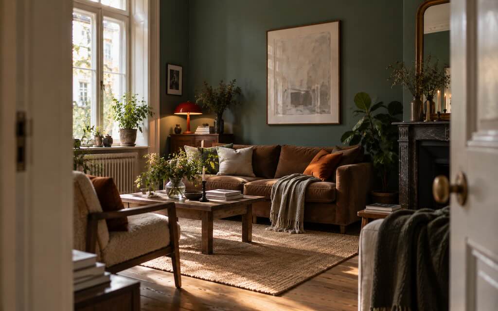
A room can contain colours you like individually and still feel strangely unresolved.
The blue sofa is good. The rug is good. You chose the wall colour carefully. The rust cushion looked right in the shop. Nothing is obviously wrong, yet from the doorway the room seems to be having several conversations at once.
This is where the 60-30-10 decorating rule can be surprisingly useful — as long as you stop treating the numbers as measurements.
In its familiar form, the principle suggests giving roughly 60% of a room to a dominant colour, 30% to a secondary colour and 10% to an accent. Contemporary interiors sources still use it as a starting point for building balanced colour schemes, with the largest surfaces and furnishings typically forming the dominant share and smaller details providing accents. Homes & Gardens includes the idea among its basic principles of interior design, while designers also use variations of it for colourful and analogous schemes.
You do not need to calculate whether the curtains occupy exactly 17% of your field of vision.
A better question is simpler: what dominates the room, what supports it, and what attracts attention?
Once you look at 60-30-10 that way, it becomes less of a colour formula and more of a method for diagnosing why a room feels balanced — or why it doesn’t.
The numbers describe roles better than quantities
Imagine a living room with pale green walls, a large brown sofa, an old oak floor, cream curtains, a patterned rug and a red lamp.
Trying to assign precise percentages to those elements quickly becomes absurd. Does the floor count as brown? What about the oak table? Is cream part of the green-dominant background because both are quiet, or a separate colour? How much of the patterned rug belongs to each category?
Fortunately, none of this needs an answer.
The useful part is recognising that some elements create the visual field of the room, others give it structure, and a smaller number draw the eye.
The dominant part might be green walls and the garden visible through the windows. Brown wood and upholstery might form the supporting layer. The red lamp might be the accent.
Or not. Move the lamp to the centre of the room, make it glossy scarlet and place it against a pale wall, and its importance changes without its size changing at all.
That is why percentages can only take you so far.
Ten percent can easily become the loudest thing in the room
Physical area and visual weight are not the same thing.
A charcoal armchair can carry more visual weight than a much larger cream sofa. One cobalt cushion can pull the eye more strongly than metres of pale curtains. A black pendant hanging in open space may register before the dining table underneath it.
Contrast matters. So do darkness, saturation, pattern, shape and position. Experimental research on colour perception has found relationships between colour context and perceived visual heaviness, while other research has associated darker colours with greater perceived weight. These studies are not decorating instructions, but they support something easily observed in real rooms: equal areas of colour do not necessarily feel equally prominent.
This is particularly important with the supposed 10%.
If a room is mostly chalky white and pale oak, a small amount of saturated orange may already provide plenty of accent. Adding orange cushions, orange ceramics, an orange throw and orange artwork because you have not yet reached some imaginary quota can weaken the very effect you were trying to create.
An accent works because it interrupts something.
Sometimes one interruption is enough.
Your room already has a palette before you decorate it
Colour schemes often begin on a screen with three or four neat swatches. Actual rooms are less cooperative.
There is already a floor. Perhaps there are honey-coloured boards running across most of the room, or grey stone, or terracotta tile. The kitchen cabinetry may occupy an entire wall. A fireplace might bring red brick or dark marble into the centre of the space. There are window frames, doors, radiators and pieces of furniture too expensive or too useful to replace because they complicate a palette.
These things count.
A room with oak flooring, a large walnut table and exposed ceiling beams is already carrying a substantial amount of warm brown even if nobody chose “brown” as one of its decorating colours. A kitchen with dark green cabinetry may already have its dominant element before the walls are painted.
This is one reason the dominant 60% does not need to mean neutral walls.
It can be blue cabinetry, terracotta walls, a green ceiling and walls treated as one field, or the extensive warm timber of a room where the architecture itself sets the palette. Contemporary designers regularly apply the 60-30-10 principle to rooms in which the dominant colour is decidedly not beige; Architectural Digest, for example, discusses its use within analogous colour schemes.
Before deciding what colour a room needs, it is worth identifying the colours it already has.
Two versions of the same colour are rarely the same presence
Texture complicates the percentages further, in a useful way.
Consider three objects in roughly the same cream: a flat painted wall, a bouclé chair and a glazed ceramic lamp. They may sit close together on a colour chart. In a room, light behaves differently across every surface.
The wall can look quiet and continuous. The fabric breaks into highlights and shadows. The ceramic catches the window and produces a hard point of brightness. Change the hour of the day and the relationship changes again.
This is why rooms built from a narrow palette do not necessarily feel flat. Material variation can create hierarchy without adding another obvious colour. Linen beside lacquer, wool beside stone, matte paint beside glass: their differences give the eye somewhere to go.
It also explains why buying another colour is not always the answer when a scheme feels dull. Sometimes the room needs a different surface rather than a different hue. Contemporary guidance on colour schemes similarly treats texture and material as integral to how colour behaves in a room rather than as decoration added afterwards.
Look from the doorway before you buy anything
The easiest way to use 60-30-10 requires no measuring tape and no shopping.
Leave the room.
Come back to the doorway and stop there for a moment. Before looking at individual objects, notice what you register first. Then what forms the background. Then what your eye moves to next.
If you immediately see the sofa, the dark rug and a large piece of artwork all demanding equal attention, the room may not have a colour problem at all. It may have three dominant elements competing for the same role.
If nothing attracts attention, the opposite may be happening. Everything is supporting everything else. That can be restful when intentional, but it can also explain why a carefully furnished room somehow feels unfinished.
Try removing something before adding something. Move the bright cushion out for a day. Fold away the patterned throw. Shift the lamp to another wall. If the room settles, you have learned more than another afternoon of looking at paint samples would have told you.
The same exercise works in reverse. If a room seems visually empty, you may not need five new accessories. It might need one element with enough presence to become a focal point.
The point is not to make every room calm or understated. It is to understand where its attention is going.
Some rooms do not need this rule at all
A tonal room may depend on tiny shifts within one family of colours rather than an obvious dominant-secondary-accent relationship. A maximalist room can intentionally allow pattern, artwork and objects to compete. In a space built around an extraordinary tiled floor, painted ceiling or wall of books, architecture or a collection may matter more than any three-colour scheme.
Pattern makes the calculation particularly unhelpful. A large floral curtain can contain six colours while still reading as one visual mass. A Persian rug might be technically full of red, blue, cream and green but function in the room simply as the dark, intricate element beneath quieter furniture.
There are also rooms where the lack of hierarchy is the point. Shelves crowded with ceramics, layered textiles, paintings hung from skirting board to ceiling: abundance can have its own coherence.
In those spaces, forcing everything into 60, 30 and 10 can make the room less interesting rather than more resolved.
The rule is most useful when something feels off and you cannot see why. Stand at the doorway and forget the arithmetic. Ask what dominates, what supports and what keeps asking you to look at it.
You may discover that you already own everything the room needs.
FAQ
What is the 60-30-10 decorating rule?
The 60-30-10 decorating rule is a guideline for creating colour hierarchy in a room. Roughly 60% is treated as the dominant colour, 30% as a supporting colour and 10% as an accent. The percentages are best understood as approximate roles rather than measurements.
Do you have to follow 60-30-10 exactly?
No. The rule is a starting point for thinking about balance. Contrast, saturation, darkness, pattern, texture and placement can make a small object visually stronger than a much larger one, so literal percentages are rarely useful in a real room.
Does the 60% colour have to be neutral?
No. The dominant colour can be dark, bright or highly distinctive if it suits the room. Blue walls, green cabinetry or extensive warm timber can all form the dominant visual field. Neutrality is not part of the rule.
Do flooring and wood count in a room’s colour scheme?
They should be considered. Flooring, timber, stone, cabinetry, tiles and large existing furniture can occupy substantial visual space and influence how every added colour reads. Ignoring them can make an otherwise sensible palette feel disconnected from the room itself.
When does the 60-30-10 rule not work well?
It can be less useful in tonal or monochromatic interiors, maximalist rooms, heavily patterned spaces and rooms where architecture, art or collections establish the visual structure. In those cases, hierarchy may come from material, scale, pattern or repetition rather than three distinct colour proportions.